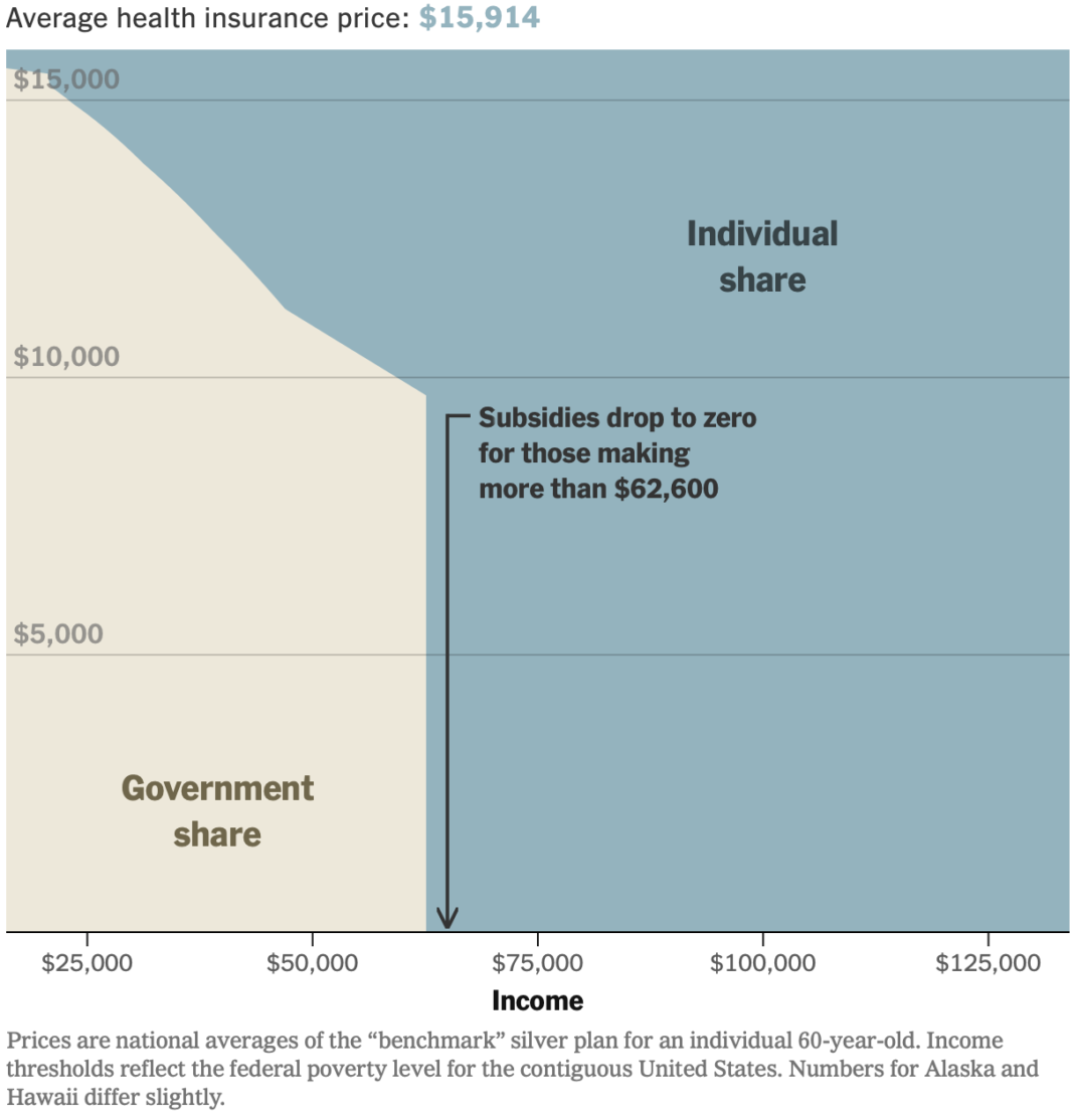
In January, the scale for U.S. healthcare subsidies changed, which reintroduced a cliff. If your household makes even a dollar more past the cutoff, you get zero subsidies. For NYT’s the Upshot, Irena Hwang, Josh Katz, and Margot Sanger-Katz take you through an area chart of the changes and how we got to where we are now.
This is geometrically a simple stacked area chart with two categories for government and individual share. Income is on the x-axis and the amount of government subsides is on the y-axis.
But the financial cliff metaphor and the changes as you scroll highlight what happened in January when subsidies were cut. This seems like it would’ve been a useful chart during the government shutdown a few months ago.

